9 Dark & Moody Event Design Ideas That Feel Luxe, Not Heavy

Dark design has the ability to elevate a space instantly, but it can just as quickly fall flat. When it works, it appears intentional, layered, and high-end. When it doesn’t, it becomes hard to navigate and visually draining. The difference isn’t the color palette. It’s the control behind it. Most corporate events play it safe with bright, even lighting that focuses on visibility over experience. Dark design does the opposite. It creates contrast, directs attention, and sets the atmosphere from the moment guests walk in. The goal isn’t to make a room darker. It’s to make it more intentional.
1. Multi-layered Lighting
The most common mistake in dark design is reducing light rather than shaping it. Don’t just turn the light level down across the entire venue. All you’ll achieve is making the space darker and flattening the design out. People will become annoyed. It’ll be harder to navigate around the room. Other people are harder to see. Eating and drinking are a struggle. You muted the experience.
Layered lighting replaces that with structure.
Instead of one consistent level of light, the room is built with multiple sources at different intensities. Table lighting creates intimacy. Accent lighting defines pathways. Architectural features are highlighted selectively. Overhead lighting is softened or removed entirely.
This approach is better because you create contrast instead of just making the room darker. People can still see as they walk, talk, eat, and drink.
In NYC venues, where layouts vary widely and architectural features can either help or hinder the experience, layered lighting allows you to control perception without physically changing the space.
The environment seems deliberate because every light source has a purpose.
2. Texture Over Color Saturation
Dark palettes usually rely too heavily on the depth of color alone.
Deep blacks, charcoals, and navy tones layered without variation create a dense visual field. The eye has nowhere to move. The space begins to feel heavy, even if the design itself is minimal.
Texture is also vital. Different types of materials react differently to light. Think about how velvet, silk, and cotton all look under lighting. Then think about how they look as they and the lighting move. Silk is much more dynamic and reflective than cotton.
This is where dark design begins to feel elevated.
Instead of adding more visual elements, you are improving the ones that already exist. A single material shift can change how an entire area reads.
In execution, this entails prioritizing material selection over expanding the palette. A black velvet chair, a matte black table, and a polished black surface all read differently under the same lighting.
In New York, where upscale environments regularly prioritize material quality over bold color, this approach conforms with what guests already associate with high-end design.
3. Defined Light Anchors
In a dark room, people need to understand where to go without being told.
Light anchors create that clarity.
These are intentional focal points of brightness within the space. A bar that is slightly more illuminated. A central installation that draws attention. A cluster of tables that feels visually active.
The rest of the room supports these anchors.
This works because it creates orientation.
Guests naturally move toward the light. They gather where the environment feels active. Without realizing it, they are following the structure built into the design.
In corporate events, this reduces the need for overt direction. You are not telling people where to go. You are showing them.
In NYC venues, where crowd flow can quickly become an issue, this approach sustains movement without creating congestion.
The room feels dynamic, not disorganized.
4. Controlled Reflection Instead of Shine
Adding shiny elements to your event’s design is one way to highlight the dark, moody theme. It’s not your only option, though. Reflective surfaces are another great option. Unfortunately, they are also often misunderstood.
Too much shine and reflection, and you create a lot of visual noise that is unpleasant and distracting. Don’t use enough, and the room falls flat.
Use glass, polished metal, and smooth-surfaced items to create shine and reflection. That way, you don’t add new light sources. You’re only redistributing the light that is already there.
5. Warmth Within Darkness
Dark tones come in a range of shades and temperatures. You have to understand color theory to determine how a space feels. Cool lighting in a dark environment can feel distant and sterile. Warm lighting creates contrast that feels cozy.
Guests stay longer in more comfortable spaces. The warm understones and hues encourage guests to stay longer.
6. Negative Space as a Luxury Signal
Overfill a dark space, and you’ll make it feel like a miserable place to be. Not only will guests feel cramped, but they will feel weighed down. Stop putting so much furniture, installations, and elements in the room. Embrace the negative space.
Leaving areas intentionally open creates contrast. It allows the design to breathe. It reads as luxury. Not because there is less, but because what is there has room to stand out.
7. Directional Flow Instead of Even Distribution
Even distribution flattens a room.
When everything is lit the same way and arranged without hierarchy, the environment feels static. There is no movement. No natural progression.
Directional flow introduces rhythm.
Lighting, layout, and design elements are used to guide guests through the space. Pathways are suggested, not forced. Sightlines lead from one area to another.
This creates a sense of progression.
Guests move naturally. They explore. They engage with different parts of the environment without needing direction.
In corporate events, this supports interaction without requiring additional programming.
In NYC venues with complex layouts, this approach turns structural challenges into design opportunities.
The space appears intentional because movement seems natural.
8. Elevated Minimalism Instead of Overdesign
What’s brilliant about dark designs is that they thrive in minimalism. You don’t need to be over the top or excessive to impress. Event planners who overdo it and add excess are only adding visual weight.
The goal is to achieve elevated minimalism. Use fewer pieces that are more impactful. This design shift lets the room to stand on its own.
When designing the layout, focus on scale and placement. Designate one strong visual moment that will draw attention.
9. Subtle Movement Within the Environment
Events that heavily use dark themes benefit from movement. Otherwise, the environment begins to feel static and boring. It’s the subtle movement that keeps the space interesting but not overwhelming. The goal is to create presence without spectacle.
For corporate events, this subtlety creates a feeling of sophistication. The room’s design becomes part of the experience.

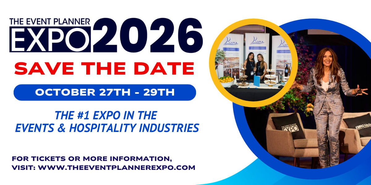
Learn More About Moody Event Designs at The Event Planner Expo
Dark and moody design is about controlling how the room is experienced. When done well, dark environments feel layered, intentional, and refined. That is what makes them feel luxe instead of heavy.
And it is exactly the kind of design thinking being refined at The Event Planner Expo 2026, where planners are moving beyond safe, evenly lit environments and into more controlled, experience-driven spaces that use light, texture, and restraint to create depth without sacrificing function.
The conversations are happening live. Get your ticket and don’t miss them.