8 Color Palettes That Instantly Make Your Event Look More Expensive
It’s frustrating when we hear event planners talk about color palette choice like a finishing touch. Color shouldn’t be added after the fact. That’s like waiting to pour the foundation until after you build a house. Color should be a driving factor in all design decisions. In 2026, color is being used less like decoration and more like direction.
1. Tonal Neutrals With Texture
Ivory, bone, taupe, oat, sand, soft mushroom. This palette never gets enough credit because people assume these colors are bland and boring. However, they usually look that way because the person styling designed them.
These colors work well for events because they allow the room's visual elements to recede. They aren’t fighting to dominate the space. The result is space that feels intentional and elegant. It’s that restraint that helps the event feel expensive.
With color not the focal point, texture becomes even more important. It’s what prevents the room from falling flat. Textures like linen, matte ceramics, brushed metals, stonewashed fabric, raw wood, soft plaster tones, and layered candlelight are all good options.
It’s this design choice that sets expert NYC event planners apart from inexperienced ones. Neutrals don’t mean plain or simple. It means looking beyond the colors to add a tactile element. Think of it like quiet luxury.
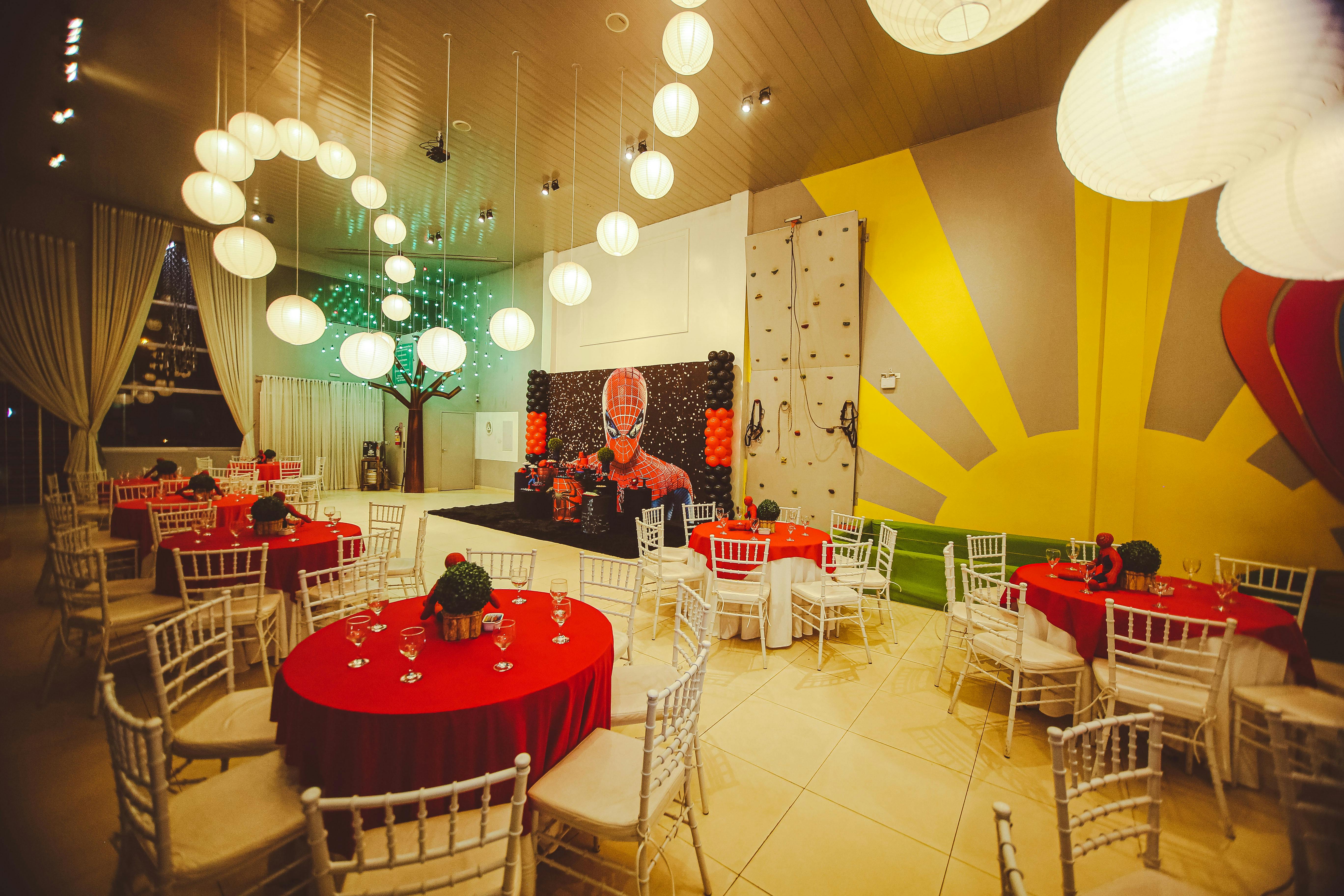
2. Black, Espresso, and Warm Metallics
Give a space a moody and masculine feel with black, deep brown, bronze, smoked brass, and antique gold. There is a strong presence and visual weight to this color palette. However, it’s not heavy. There’s a difference.
The right amount of black adds structure to the room. It’s grounding for everything happening around it. The warm metallics add light and keep the space from visually collapsing like a black hole.
Too much black and the room becomes severe. Too much metallic and it starts to feel performative. With the right balance, you can direct the guests’ eyes where you want them to go. The focal points feel purposeful.
Candlelight looks richer. Glassware reads sharper. Architectural shadows become an asset instead of a problem.
3. Soft Monochrome With One Deliberate Contrast
Choose one color family. Then use multiple shades and depths of that color. Highlight the entire venue space with a single color. This color palette is deceptively difficult to achieve. Beginner event planners think monochrome means choosing everything in the same color. However, that results in the venue falling flat.
To make a color palette like this a success, you need subtle contrast within the color family. Then the single contrast moment has authority because it is rare.
That contrast might show up in florals, menu details, upholstery, lighting temperature, or a single deeper note in the tablescape. But it has to feel earned. If the highlight color appears too often, the palette loses its discipline.
That is why it often looks more expensive than busier designs with larger budgets. It feels like someone knew exactly where to stop.
4. Deep Jewel Tones With Negative Space
Emerald. Oxblood. Sapphire. Aubergine. Deep teal. Jewel tones are a classic color palette for clients who want to create an elegant event. There’s a reason for this. These colors are highly saturated and feel sumptuous. However, there is also a risk that they backfire.
Deep jewel tones become expensive when they are given room to breathe. Negative space is what keeps them from swallowing the room whole. Overuse of them drowns the room because there is no break. Everything is equally intense, and guests don’t know where to look. Luxury goes out the window.
5. Warm Earth Tones With Clean Restraint
Terracotta. Clay. cinnamon. olive. sand. tobacco. muted rust. Warm earth palettes have an underlying maturity to them. Don’t make the mistake of thinking these colors can’t be elevated. With the right touch, a skilled event planner can take them from looking random to an elegant design.
To make them a success, you need control. Once the warm notes start drifting in too many directions, the room loses cohesion. One brown pulls red, another pulls yellow, the olive leans too grey, and suddenly the palette no longer feels grounded. You really need to understand color theory for this one.
This palette does not need ten shades to feel layered. It needs a few strong notes that actually belong together. Clay with sand. Olive with tobacco. Rust with warm stone.
6. Crisp White With Shadow and Depth
White, cream, chalk, alabaster, soft parchment. White is one of the most misunderstood palettes in event design. People treat it like a blank canvas. It isn’t.
White amplifies everything. It amplifies bad spacing. It amplifies cheap materials. It amplifies inconsistent florals, harsh lighting, and weak furniture lines. If a room lacks structure, white will expose it immediately.
A strong white palette depends on shadow, depth, and variation in finish. Matte against gloss. Opaque against translucent. Smooth linens against sculptural florals. Clean negative space against candlelit dimension. White only works when the room is built with enough contrast for it to read as intentional instead of empty.
This is where lighting becomes critical. Cooler white light can make the room feel clinical. Too much brightness can flatten every surface. But warm light moving across layered whites creates subtle dimensional shifts that feel precise and expensive.
7. Cool Neutrals With Sharp, Sparse Accents
Slate. dove grey. graphite. stone. Pewter. These cool neutrals are then accented by a single clean accent. The key is not to use multiple color accents. Just one. That’s all you need.
This color palette works because there is composure in the cool neutral tones and visual interest in the accent color. The cool neutral base calms the room. The accent creates movement without destabilizing the whole environment.
8. Muted Pastels With Architectural Structure
Dusty rose. faded apricot. muted sage. pale lavender. chalky blue. Pastels are often treated as soft and delicate. That isn’t always a bad thing. The problem is that the softness of the colors is often not paired with a strong enough structure.
Muted pastels can look extremely expensive when the room has enough clean architecture to support them. Set up visually strong tables with bold, long lines. Clean furniture design for sitting areas. Strongly define the focal points. The structure balances the pastels. Which is exactly why it reads as expensive when it lands.

Learn More About Color Palettes at The Event Planner Expo
Choosing the right color palette for your event isn’t about rarity, trends, or being bold. It’s about control and purpose. An expensive color palette creates hierarchy, reduces confusion, and eliminates the visual work guests have to do.
Rooms that feel expensive are usually rooms that feel resolved. The palette supports the event rather than competing for attention within it. At The Event Planner Expo 2026, see how color palettes can look and feel expensive.
Get tickets to The Event Planner Expo 2026 and be in the room with NYC planners.