The 2026 Event Palette Forecast: Unexpected Color Combos That Work
If you attend multiple events each year, color palette trends become obvious, repetitive, and tedious. Every few years, a color takes over, and everyone decides to use it ad nauseam. There were blush, gold, and rose gold color palette trends in recent years. Suddenly, every ballroom from Midtown to Dumbo starts looking like a copy/paste.
Top event planners know they need to track color palette trends. That way, they can stand out by choosing something different. Tell a story with color.
Electric Neutrals
It sounds like an oxymoron. How can a neutral be electric? The polar opposites of these two adjectives make these color palettes so genius. Start with warm neutrals like muted cocoa, sand, and warm greys. Then, pair them with one neon or highly pigmented bright color.
It sounds weird, but in practice, it just works. This bold color palette design will stand out because it’s daring. It works because the two color types balance each other. All neutrals would look bland and boring. All electric colors would be overwhelming and intense.
Where to use it:
-
- Corporate receptions that want sophistication and buzz
- Modern weddings that aren’t afraid to ditch the pastels
- Brand activations looking for clean lines with a hit of edge
One killer example? Driftwood grey + neon citron. Unexpected. Balanced. Very NYC.
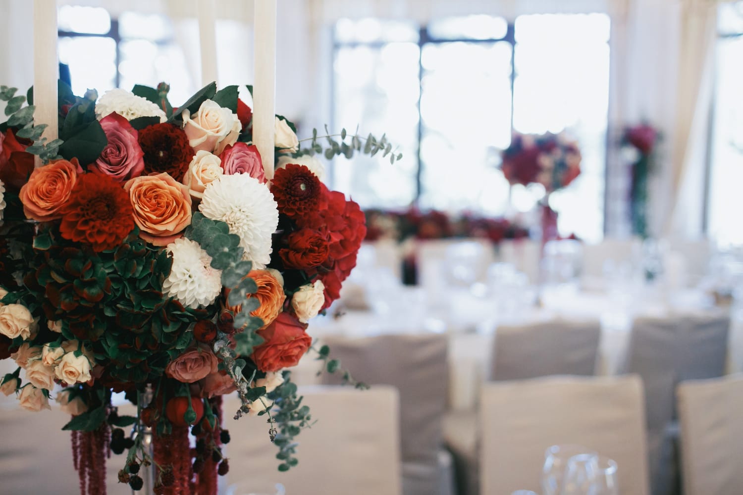
Indigo + Burnt Apricot
Blue and orange have long been a classic color combination that works. However, in 2026, event planners are giving this combo an elegant upgrade. Deep indigo creates depth. Burnt apricot adds warmth.
These two colors together balance each other to create a moody yet welcoming atmosphere. It’s perfect for the moody downtown venues. They are perfect for an evening event as they mirror the look of a vibrant sunset. It’s definitely a vibe.
It’s emotional without being dramatic. It feels expensive without requiring expensive décor. And it hits that sweet spot of “rich yet soft.”
Where to use it:
-
- Cocktail rooms
- Lounge clusters
- Printed menus and stage design
- Floral moments with sculptural lines
This combo makes guests do that subtle “ooooh” face. The one planners live for.
Fern Green + Polished Chrome
This one is pure Manhattan, sleek city energy meets organic calm.
Fern green showed up in 2024–2025 as a softer alternative to emerald. Now it’s being paired with chrome, mirrors, and metallics in a way that feels intentional, not gimmicky.
Why it works:
You get freshness without the “earthy wellness retreat” cliché. And the chrome accents? They reflect light like crazy, instantly leveling up the entire room.
Where to use it:
-
- Corporate galas
- High-end product launches
- Modern bar builds
- Futuristic stage moments
It’s clean, cool, and architectural in all the right ways.
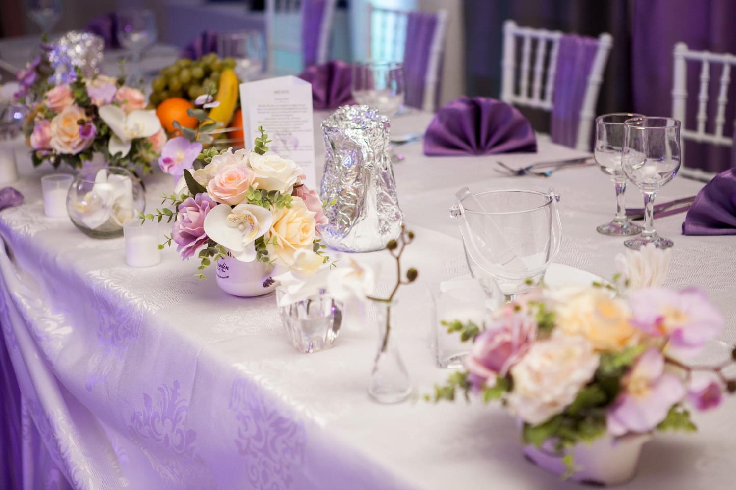
Warm Lavender + Rust
This is the combo no one asked for but everyone’s loving. Lavender gets a grown-up moment when you balance it with rust, not burnt orange, not terracotta… rust. Slightly gritty. A little nostalgic. Deep enough to anchor a pastel.
Why it works:
It’s soft and strong at the same time. It feels familiar but completely new. And it plays extremely well with textured linens and sculptural florals, especially in industrial NYC venues.
Where to use it:
-
- Floral installations
- Lounge décor
- Ceremony backdrops
- Tablescapes with mixed metals
It’s romantic without being sweet. That’s the magic.
Deep Teal + Soft Marigold
Jewel tones are perfect for events because they create a sense of elegance and drama without being over-the-top or kitsch. Deep teal and soft marigold are bold, but not loud. They feel like a modern take on classic jewel tones. The soft marigold softens the deep teal, keeping the event from feeling like a circus.
Why it works:
This combo makes even small events feel curated. And it adapts to lighting like a dream; warm lighting warms it, cool lighting sharpens it.
Where to use it:
-
- Statement entryways
- Stage backdrops
- Accent walls
- Elevated brand activations
It’s one of those palettes guests don’t see often… and thank you for.
Shadow Black + Soft Blush
This one’s for the minimalists who still want a moment.
Black is coming back in a major way in 2026, not sleek luxury black, but shadow black. Matte. Velvety. Moody. When you pair it with soft blush, you get tension. Space. Drama. Clean lines.
Why it works:
It’s extreme contrast, but softened. And it plays right into 2026’s biggest trend: designs that feel calm and intentional.
Where to use it:
-
- Step-and-repeats
- Stage design
- Modern dining rooms
- After-party environments
It’s bold, but it’s quiet-bold. It whispers instead of screams.
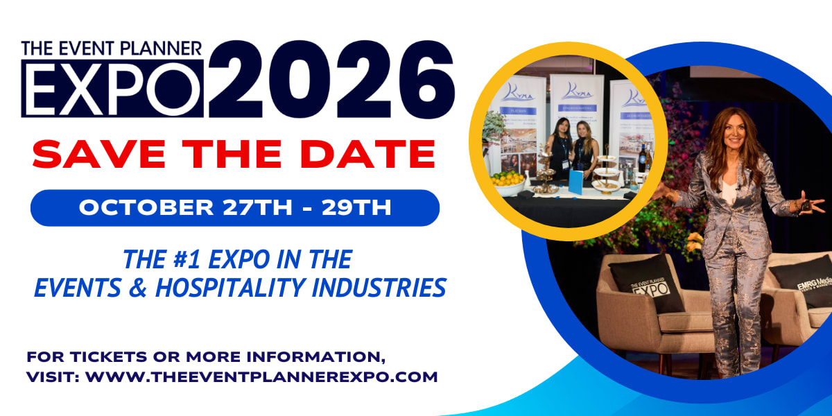
Discover All the Trending Palettes at The Expo
Trendy color palettes change with the seasons. Top event planners track trends, but they also know timeless elegance. The best color palettes are timeless for a reason: they look beautiful and are tied to an emotional narrative.
If you want to see color trends come to life in real rooms, on real stages, with real guest energy, get your tickets to The Event Planner Expo 2026. This is where NYC’s top producers, designers, and event pros show you what’s next before the rest of the industry catches on. Be there. Tickets available now!